here are a couple of ideas in addition to what I already told you all on the conf call earlier today.
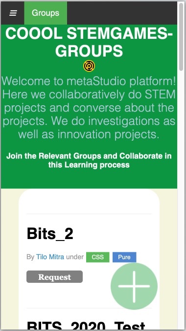
This is what the welcome page looks like right now
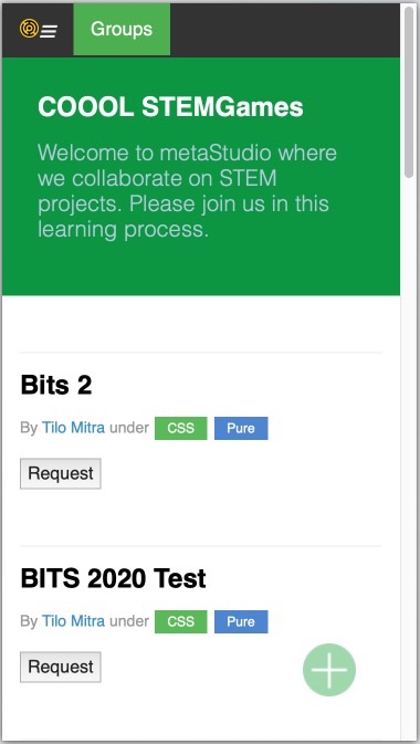
This is with a little bit of cosmetic surgery by me
The title and the welcome text are shorter and to the point. There is padding around the text to give breathing room (more on this below). The Stemgames icon was floating pointlessly in the middle of the screen. I’ve moved it to the hamburger menu where it provides a visual anchor.
Here is another example, the same URL, a bit further down

now
with changes
As you can see, the emphasis is on simplicity and white space. Everything needs breathing room, even text on a computer screen.
Also note some mods that might seem only cosmetic but go deeper. For example, you are using links for tags. Ok fine. But you are also using links for buttons (for example, the [ Request ] is a link right now). I have changed it to a proper button using the <button> tag. HTML is semantic. Use the power. Would you ask a cricket player to use a cap for a knee pad? no. Specific syntax is designed for specific elements. Explore them and use them properly.
HTML was designed for humans to read it. No human writes a word with underscores. What is Bits_2? That nonsense was invented by us computer programmers. Save it for the computers. For humans, spell it out as humans will write it, “Bits 2” (no underscores).
Also, a button saying just “Request” makes no sense because there is not surrounding context. I’ve changed the text to “Request Access” which provides that context. (Note: I forgot to change the button text in the first set of images above, but this rule should be followed everywhere. Make it easier for the user to understand what she or he is supposed to do.)
Remember, different things should look different, but don’t use “different” just for the heck of it. Everything should be there because it is needed, and nothing should be there that is not needed.
Take these ideas and run with them.